You can enter a character in an HTML document in the following ways:
meta tag.
See the W3C page
Character encodings, Alan Wood’s compilation
Unicode and Multilingual Programs and Utilities, and the
FileFormat.Info page
How to enter Unicode characters in Microsoft Windows.
♥ (using the number in hexadecimal).
The number is taken as decimal if not preceded by x.
For example, the letter é (U+00E9) can be written as
as é or as
é.
♥,
the letter é (e with acute accent)
as é,
and the character ¦ (broken vertical bar) as
¦. There is a limited number of characters for
which an entity has been defined.
For a handy reference, check out Alan Wood’s
Test pages for Unicode character ranges. Warning:
HTML5 drafts
have an extended set of “named character references,”
but the added names have limited browser support, and they add nothing
to the expressive power of HTML, just quasi-mnemonic names to
be used instead of code numbers.
In addition to these primary methods, a character might be entered
via JavaScript code, where a string literal can contain a character
using a “backslash escape” such as
\xe9
or
\u00e9. In CSS code, character data to be added to
the document rendering might use a different
“backslash escape,” such as
\0000e9.
<!doctype html>

<meta charset=utf-8>

<title>Démonstration</title>

Voilà ! ☺☻
Usually the best option is to enter characters as such, using a Unicode-capable authoring tool and saving and serving the document as UTF-8 encoded. This makes the HTML source more readable and avoids steps that might introduce errors. Just make sure that UTF-8 is properly declared:
Content-Type: text/html;charset=utf-8
(check this out using e.g. an HTTP header viewer like
Web-sniffer), or
Content-Type: text/html) and you indicate the
encoding in the document itself e.g. using
<meta charset=utf-8>
This page does not use UTF-8, because it would complicate maintenance. I edit the page via a Unix shell connection using the Emacs editor.
The problems of representing characters in HTML have generally been solved thanks to better browsers. The problem of rendering characters remains.
By the specifications, browsers should display a character if
there is any font in the system that contains it.
If the fonts specified by the author (in CSS
font-family settings or, rarely these days,
using font markup in HTML) do not contain the character,
browsers are supposed to use fallback fonts. The same applies if no fonts are
specified by the author; browsers should use primarily their default fonts,
using alternate fonts for any character not covered by the primary font.
In practice, things don’t always work that way. Especially IE is notorious for its failures in this respect. It often fails to display a character, even though it could do that if it used all the fonts in the system. If a browser cannot render a character, it may show a small rectangle, possibly containing a question mark, ?, or some similar indicator. Here’s a quick test (character U+0840, which is probably not supported by any font on your computer): ࡀ.
The fallback font principle has pitfalls. The problem is that there is no guarantee that characters from different fonts fit together. In the the following screenshot, some of the Chinese characters disturbingly look bold. On a closer look, they turn out to be from a sans-serif font that differs from the basic font of the text. In any case, the appearance of the text is disturbing, and the reader may suspect that it is erroneous and not just poorly displayed. This may happen if you have Chinese text and you do not specify the font, or you specify fonts that do not contain all the characters needed.
 For texts in Latin letters, such problems have become relatively rare.
Most commonly used fonts cover the Latin letters rather well. But if you either
need some rare letters or use a special font, problems may occur. Fonts designed
for special use, like a company’s brand font or
an artist’s personal font, often have a limited
character repertoire. When a fallback font is then applied,
an accented letter like ă might appear stylistically quite
different from the corresponding unaccented letter (a).
For texts in Latin letters, such problems have become relatively rare.
Most commonly used fonts cover the Latin letters rather well. But if you either
need some rare letters or use a special font, problems may occur. Fonts designed
for special use, like a company’s brand font or
an artist’s personal font, often have a limited
character repertoire. When a fallback font is then applied,
an accented letter like ă might appear stylistically quite
different from the corresponding unaccented letter (a).
Thus, you should
font-family rule
If you need to resort to fallback fonts, try to make their use consistent. For example, the Arial Unicode MS font is a suitable fallback for Arial and maybe for some other fonts in the same general design. But for an essentially different basic font, try to find fallback fonts that resemble it better.
There is handy information about font support for characters in the FileFormat.Info site, section Characters. The information does not cover all fonts, but it lists all the fonts that you can normally expect your visitors to have, and a lot more. The following simple form is a quick way of accessing the information:

Suppose that we wish to use the HOURGLASS U+231B character. According to FileFormat.Info, there are eight fonts that contain it. But if you look at the character in the fonts (you can click on the “View All” link on the result page to see them), you will notice that some of them are unsuitable. Moreover, as you check from Alan Wood’s font information page, most of the fonts are rather special. More exactly, this is the situation with them:
font-style: oblique or
font-style: italic.To summarize, if you use the HOURGLASS character, visitors will
see it if and only if they have Office in their system or they have some
of the special fonts that one needs to download and install separately.
Others will see just a question mark in a box, the code number 213B in a box,
or something similar. If you decide to take your chances, then you should use
a style sheet that applies the following declaration to an element containing
the character:
font-family: Quivira, "Arial Unicode MS", Symbola, "Everson Mono";
The order of the fonts in the list is up to you of course,
putting first those fonts where the rendering looks best.
Simple tests:
⌛ (HOURGLASS character with no font settings)
⌛ (HOURGLASS character with the above-mentioned font settings).
Font support for CONTOUR INTEGRAL ∮ (U+222E) is relatively widespread, though the fonts are special fonts rather than commonly used copy text fonts.
The combined availability of the fonts on computers is fairly good, so you might not even need to do any font settings. However, it may still be useful to do such settings, partly because the same settings can be used for many other mathematical characters. In addition to potentially helping some browsers to render the character at all, the font settings may help to create more pleasant and uniform typographic appearance.
The main problem is the ordering of the fonts in a
preference order. Normally, mathematical texts work better when rendered
in serif fonts, since the serifs help to distinguish
mathematical symbols from
each other and from other characters. Many symbols do not contain serifs but
they may still match serif font design better.
On the other hand, mathematical symbols should match their traditional
shapes in books, if possible.
Such considerations, as
well as
elimination of some redundancies, could lead to the following
list, based on FileFormat.Info data on
font support for CONTOUR INTEGRAL and some additional information:
font-family: "Arial Unicode MS", "Lucida Sans Unicode", "Cambria Math", "Asana Math", "OpenSymbol", "Symbola", "Quivira", "STIX",
"Code2000", "DejaVu Sans",  "unifont";
There is more information about using mathematical characters in HTML on the page Math in HTML (and CSS). See also Mathematical symbols in ISO 80000-2 – a test page.
Letters with a diacritic mark, such as “é”, have two representations:
If you are using character references, you would use
é in the first case,
é in the latter. Here is how
your browser renders them in this
context: é versus é.
The visual rendering is generally expected to be the same, but in reality it may vary. Sometimes the font being used does not contain the precomposed character. More often, the font does not contain the combining mark. When the mark is taken from a different font, disaster may result.
In most cases, precomposed characters work better. It is better to use a glyph designed by a typographer than to let browsers construct a character from a base character and a combining diacritic mark. Especially older browsers do the construction work often poorly. For acceptable rendering, the browser needs to inspect the properties of the base character and position the diacritic mark accordingly. For example, the diacritic mark in É needs to be placed in a vertically higher position than in é. (On the other hand, an advanced browser may recognize that the base character and the combining mark are equivalent to a precomposed character and use a glyph for it.)
Browsers, search engines, and other software (e.g., editors, when working on text copied from a web page) generally work better with precomposed characters, due to their simplicity. It’s just yet another character, one Unicode code point. Moreover, precomposed characters are used much more often than combining marks, so there is strong motivation for software designers to handle them.
However, not all combinations of letters and combining marks exist as precomposed characters. There is a fixed number of precomposed characters in Unicode. So for some (relatively rare) characters used in different languages and notations, you may need to use combining marks.
font-family list for text in general and some
special font-family list for special characters,
wrap the latter in font or span elements
with a class attribute, e.g.<font class=special>⌛</font><span class=special>⌛</span>.special { font-family: Quivira, "Arial Unicode MS", Symbola, "Everson Mono"; }font tag is evil, but it’s really
more descriptive than span here.
It makes no real difference, though.
sans-serif
or serif to your font-family list.
There is little reason to do so for special characters
with limited support in fonts, especially since the serif vs. sans serif
distinction is often irrelevant for them.
font-family list,
instead of relying on general statements about them.
This may mean that you need to download and install many fonts and
test pages with different style settings before writing the
ultimate style sheet.
 Sometimes the rendering of a character in a font is so poor
that the font is best omitted from the
Sometimes the rendering of a character in a font is so poor
that the font is best omitted from the font-family
list. The glyph for the character might be illegible in any normal font
size, or it might be completely wrong, due to a mistake in
font design.
Be extra careful if the special characters might appear in italics or in bold. Most fonts with very large or specialized character repertoire lack italic and bold versions. Web browsers will still apply italic and bolding to them, but by algorithmic methods that produce very poor results. The slanting tends to be excessive.
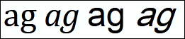 In the image on the right, the letters “ag” appears first in
Cambria as normal and italic, then in Arial Unicode MS as normal
and (fake) italic.
The letters “ag” normally have rather
different shapes in italic; that
belongs to the idea of italic.
When they are set in Arial Unicode MS,
which lacks italic, you can still apply e.g.
In the image on the right, the letters “ag” appears first in
Cambria as normal and italic, then in Arial Unicode MS as normal
and (fake) italic.
The letters “ag” normally have rather
different shapes in italic; that
belongs to the idea of italic.
When they are set in Arial Unicode MS,
which lacks italic, you can still apply e.g. <i>
to them, but browsers will mechanically slant normal letters.
 When applying “fake italic”
and “fake bolding”, browsers may italicize or
bold symbols that get badly distorted in such processes—think
about slanting the vertical bar “|”. Even if the character
remains recognizable, it often gets a wrong shape. Italic is supposed
to pick up a particular design for letters, not to
slant any character. There are two ways to prevent
wrong effects:
When applying “fake italic”
and “fake bolding”, browsers may italicize or
bold symbols that get badly distorted in such processes—think
about slanting the vertical bar “|”. Even if the character
remains recognizable, it often gets a wrong shape. Italic is supposed
to pick up a particular design for letters, not to
slant any character. There are two ways to prevent
wrong effects:
<i>The <font class=special>⌛</font> icon.</i>
<i>The</i> <font class=special>⌛</font> <i>icon.</i>
.special { font-style: normal; font-weight: normal; }
In many cases, the difference between two symbols in text can be regarded either as a character difference or as a difference in rendering style for a single character. For example, there are many characters in Unicode that are italic or bold counterparts of normal characters.
Mostly, it is best to use
styling to make the difference. For example, we show an italic x,
x,
using suitable HTML markup (e.g., the i element),
instead of looking for italic x as a separate character.
For example, if you need Fraktur (Blackletter) letters e.g.
in mathematical texts, it is probably best to use normal
letters and style them. You would use markup like
<span class=frak>z</span> and a suitable
CSS rule like .frak { font-family:
UnifrakturMaguntia } to produce a
Fraktur z, z.
(This example uses a Google font.)
A different approach (which might be regarded as theoretically better, but practically not so) is to characters like U+1D537 MATHEMATICAL FRAKTUR SMALL Z. Since this character is present in few fonts only, and none of them is probably installed in your visitors’ computers, you would need to use a downloadable font in this case, too, in practice. This would mean using a large font like Quivira or Symbola.
 When characters from different fonts are mixed,
line spacing may become uneven. A drastic example is that
if some characters are taken from the Cambria Math font,
there will be a huge amount of space above and below any line
that contains them.
When characters from different fonts are mixed,
line spacing may become uneven. A drastic example is that
if some characters are taken from the Cambria Math font,
there will be a huge amount of space above and below any line
that contains them.
For example, the diameter sign (⌀) and the inch sign (″) are needed relatively often. However, they are not present in most fonts. Authors may thus encounter the problem when they try to use these characters instead of the common but logically and typographically inferior replacements like letter o with stroke (ø) and Ascii quotation mark (").
The reason is that fonts have different default line heights. The line height is the distance between baselines of text. The actual height of a line is determined by the maximum line height of its characters.
For example, for text in Cambria font in 16px size, the default line height is typically 19px (depending on browser). For Arial Unicode MS in the same size, the default line height is 21px, which causes some disturbance. But with Cambria Math, the default line height is 89px, causing a gross effect.
 A simple fix is to set the
 line-height
property in CSS. Its value can be specified as a pure
number, which is interpreted as relative to the font
size of the element. Typical defaults are around 1.2, but
you might wish to use a larger value like 1.3 especially
if there are tall characters in the text.
The important thing is to level out the differences within text.
Sample
style sheet:
* { line-height: 1.25; }
Web fonts, i.e. fonts that are automatically downloaded from a web server to a client, can solve problems with fonts. One of the problems is that to cover most browsers, you would need to make a font available in different formats.
You can use tools like Font Squirrel @font-face generator, which generates the font files you need and a CSS file for using them. It has “Expert” option in its user interface, for selecting e.g. a collection of Unicode numbers or ranges of numbers, to avoid embedding a large font in its entirety. However, the generator is slow and fails for some fonts (just does not produce anything).
Another service is CodeAndMore, which is fast and works even for some fonts that Font Squirrel cannot handle. But it has nothing corresponding to the “Expert” option. For large fonts, the resulting files can thus be quite large.
There are also other font conversion services, such as Fontie (beta).
Beware that there are also fake services in this area, too, e.g. services that do not actually do anything useful but try to persuade you into loading some software (malware).
However, Google Web Fonts offer a simple solution. They are currently suitable mainly for normal texts in different languages rather than mathematical, technical, or other special symbols.
For example, the Khmer (Cambodian) writing system
is poorly supported in fonts. The odds are that a user does not see
Khmer letters unless he has installed either Code2000 or some special,
Khmer-oriented font. You can greatly improve the situation by choosing
one of the Google Web Fonts that support Khmer,
say Suwannaphum, and using it on your
page as follows:
<link rel=stylesheet href="http://fonts.googleapis.com/css?family=Suwannaphum">
You would then use the font normally in CSS, e.g.
.khmer { font-family: Suwannaphum, Code2000; }
The Code2000 font is included to deal with the possibility that the
user’s browser has been configured not to use web fonts. (It is not
probable that Code2000 is available, but you can always try.)
The following line is Khmer text that has been set to use the Google Web Font:
ខ្ញុំអាចញ៉ាំកញ្ចក់បាន ដោយគ្មានបញ្ហា
Google has an activity that they call Early Access fonts, supporting several languages for which it can be difficult to find suitable fonts otherwise, such as Bengali, Georgian, and Kannada.
In the early days of the web, it was common to present special characters as images. Nowadays such methods are rarely needed, and you get much better rendering using characters. But sometimes you need to use a character that has too limited font support. You can then consider using an image. This can be a more practical choice than using a downloadable font, if you need just one character, or a few characters.
For example, if you need to use the character
U+1F300 CYCLONE in text, you should be worried about fonts:
only a few fonts like Quivira, Symbola, and Unifont contain it.
But you can use
 in text as an image:
<img src=cyclone.gif alt="ἀ" class=char title=
"the character “cyclone”"
if you have it in suitable size in cyclone.gif.
Guidelines:
0.8em
or something close to that, e.g.
img.char { height: 0.8em; }.
Specifying height only means that the image
is scaled so that its height to width proportion is preserved.
vertical-align: bottom, and in that case,
the height can be set to 1em or even a little higher.
These settings should be taken into account when designing the image.
A simple way to get an image representing a character is to use Unicode Character Search at FileFormat.info. Each character description page contains an image of the character, in a sans-serif font, as a 100 by 100 pixels PNG image.
Tricks that try to extend character repertoire with fonts in proprietary 8-bit encodings are still in use to some extent. The idea in them is to some collection of characters positions from 0 to 255 in a font and to persuade programs into using that font.
For example, the widely available Symbol font is such a font,
and so are the Wingdings fonts. If you write
<font face=Symbol>X</font> in HTML,
then the correct things for a browser would be to show the letter X in
some other font, because Symbol does not have letter X.
This is how e.g. Firefox behaves.
Instead, many browsers (like IE) render the character that has been placed into
the code position of letter X (58 in hexadecimal), namely the Greek
capital letter xi (Ξ).
Such tricks with the Symbol font were rather common in the early years of the Web, but for a long time, much more reliable alternatives have existed for any character that appears in Symbol.
However, for some writing systems the approach is still used quite a lot. If the amount of characters is relatively small and the characters are not well supported by commonly available fonts, the trick looks like a simple solution. Nowadays, sites that use it (such as Eenadu, a Telugu-language newspaper that uses the Eenadu font) often use the font as a web font (downloadable font), so most users will see the text as intended. If they try to copy and paste the Telugu text, they will notice that it turns to gibberish like “ª½Â¹h¢.”.
The trick works in this case on Firefox, too, with caveats—it does not work if browser settings somehow disallow the use of the particular font. The reason is that the Eenadu font does not contain information about its coverage for characters.
There are two documents that are still worth reading if considering the use of this trick: <FONT FACE> considered harmful by Alis Technologies and Using FONT FACE to extend repertoire? by Alan J. Flavell.
A newer trick is to use so-called icon fonts. Although it is possible to create a properly encoded font that contains a repertoire of icon-like characters (and maybe nothing else), “icon font” usually means a privately encoded font. This means that it uses Private Use code points, which are code points that are not assigned and will never be assigned to a character by the Unicode standard. They are meant to be used according to private agreements. Obviously, they are thus unsuitable for public information interchange.
Such “icon fonts”, like the one provided by Twitter Bootstrap, may appear to be very handy. However, they rely on CSS and on the use of a specific font. For example, if a browser has been set ignore fonts suggested on web pages, the user will see generic symbols of undefined characters or maybe some completely different icons, if the browser for some reason uses another font that has some glyphs at those code points.
However, using an icon font has the technical advantage that font rendering is based on vector graphics and may thus produce better results than scaling e.g. a GIF or PNG image.
In addition to normal content in a document, browsers may render other texts in special ways. This includes
title attributes
and displayed on mouseover
alt attributes
and displayed (in many situations) instead of an image when the
image cannot be shown
<title>
elements and typically shown in the browser’s top bar or in a tab icon
The font(s) used in tooltips depend(s) on the browser, which may or may not use settings made at the operating system level. Thus it may be controllable by the user, though few users know about this. In any case, it is outside the control of the author. Typically, the font used is some simple sans-serif font in small size, often with a limited character repertoire, especially in older browsers.
This implies that the repertoire of characters you can use there may vary. Other characters may thus be absent, with e.g. small boxes shown instead.
Partly for reasons like this, authors are more and more moving towards using other techniques
than the
title attribute, namely
“CSS tooltips” (or maybe “JavaScript tooltips”).
This lets you use the same fonts as in the textual content or, if preferred, to set some suitable other fonts.
A simple way to set up a CSS tooltip is
to use an attribute of own your, preferably a so-called
data-* attribute,
say
data-tip="...",
and use generated content to show its value on mouseover.
There is great variation in font support to characters, from practically universal to practically nonexistent. It is not possible to specify a list of “safe” characters. You need to weigh the importance of using special characters against the risks. Some guidelines and hints: